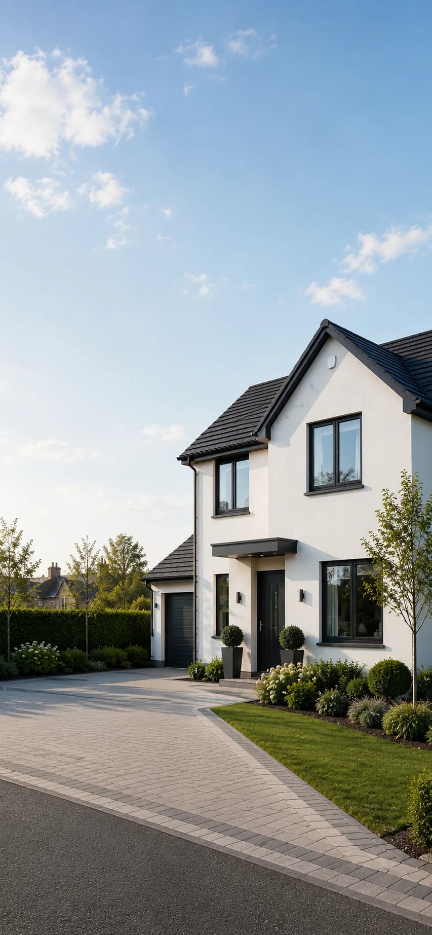
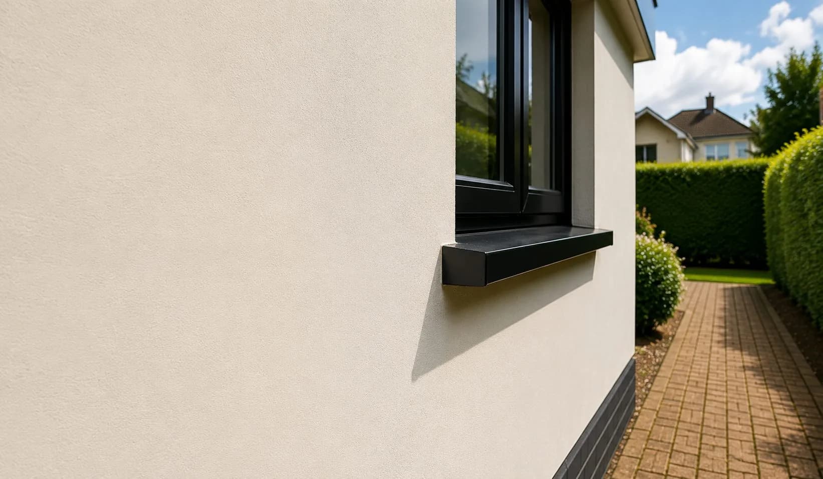
Choosing an external render colour is one of the decisions homeowners most frequently get wrong — not because they lack taste, but because render samples, screens and physical chips all look different from the finished wall in real daylight. This guide explains the principles behind good colour choices and the most common mistakes.
Why colour looks different on a wall than on a chip
Colour perception is affected by scale, light and context. A colour that reads as a warm mid-grey on a small sample chip will read as noticeably darker and cooler across an entire house elevation in English daylight. North-facing walls receive no direct sun and will appear several shades darker than a south-facing wall in the same colour.
The practical implication: always go at least one shade lighter on the actual chip than you think you want. The render on the wall will read darker. If you want a clean warm white on the house, the chip colour that achieves it is usually closer to a pale cream in isolation.
Similarly, a colour viewed on a screen will look different from the same colour in physical chip form, which will in turn look different from the finished wall. Screen renderings and visualisations are useful for establishing a general direction, not for confirming a precise colour decision.
What tends to work for different property types
- Victorian and Edwardian properties. Warm whites, creams and very pale stone tones tend to suit the proportions and detailing of older properties. Strong, saturated contemporary colours — deep grey, anthracite, dark green — can work but require careful execution: they emphasise any imperfections in the render surface and can look incongruous in a streetscape of lighter tones. Heritage whites and off-whites are the safe choice.
- 1930s semis. The widest range of colours tends to work, because the architecture of 1930s semis is less prescriptive than Victorian or Georgian. Warm mid-tones — pale taupes, warm light greys, stone shades — sit particularly well. Bright white can work but shows dirt faster in exposed locations.
- Post-war and 1960s/70s properties. Contemporary colours — mid-greys, warmer greige tones, light anthracites — often transform the appearance of post-war architecture more effectively than heritage whites. These properties were not designed with a particular colour character in mind, which gives more latitude.
- Conservation area properties. Many conservation areas have specific colour guidance or requirements — and some have Article 4 Directions that affect what render systems are permitted at all (see our planning permission guide). Traditional lime washes and mineral renders were applied in stone-adjacent tones — pale yellows, warm creams, off-whites. Working within this range is both practically safer and usually aesthetically appropriate. In York and Harrogate, local authority colour guidance documents are published on their respective planning portals.
Reading the street context
Your property sits in a street. How it reads in context matters more than how it looks in isolation. Three questions worth asking before finalising a colour:
- What colours dominate the immediate streetscape? A colour that harmonises with adjacent properties looks intentional; one that clashes reads as a mistake, regardless of whether the individual colour is attractive in isolation.
- Is the property semi-detached? A semi-detached house that renders only one half can look very odd if the colour is not related to the neighbouring half. Where both halves are being done simultaneously this is straightforward to manage; where only one is being done, the choice needs to accommodate the existing neighbour.
- Does the property have features in a different material? Window frames, doors, sills, roof tiles and brickwork above the damp-proof course all interact with the render colour. Render that clashes with the roof tile colour, for example, creates a discordant result that is obvious from the pavement.
Practical steps before committing
- Order physical colour chips, not just digital renderings. Most render manufacturers supply large physical colour chips on request. Hold them against the wall in different light conditions before deciding.
- Look at the colour in both direct sun and shade. Check it in morning and afternoon light. A colour that looks good in one condition often looks different in another.
- Ask your installer what they have seen work locally. An experienced local contractor has applied hundreds of colours on properties similar to yours and can tell you what tends to look right and what tends to look wrong in your specific area.